How To Make A Room Feel Larger Using Color Theory
COLOR IS POWERFUL.
There are many things to consider when picking out colors for your space. “What colors will match my existing furniture? How can I use color to complement the carpet, tile, or wood flooring? Will a lighter color make it more difficult to wipe off the marker, crayon, lipstick, and spaghetti that my toddler will inevitably smear all over my brand new paint job?”
Color is a powerful tool in interior design. It affects your entire experience through a multitude of ways; it can welcome you into a space, calm your nerves, increase your productivity, and even make you feel hungry (see: fast food chains saturating you with the color red). But with just a few design tricks, color placement can be one of the most powerful ways to make your space feel larger or smaller.
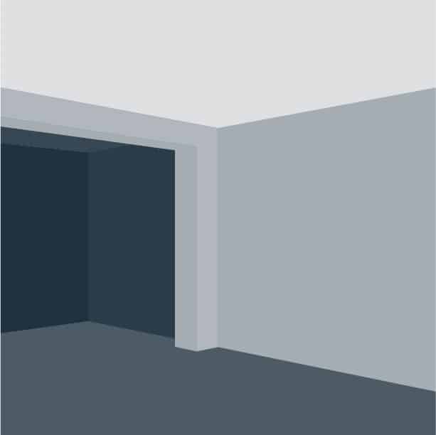
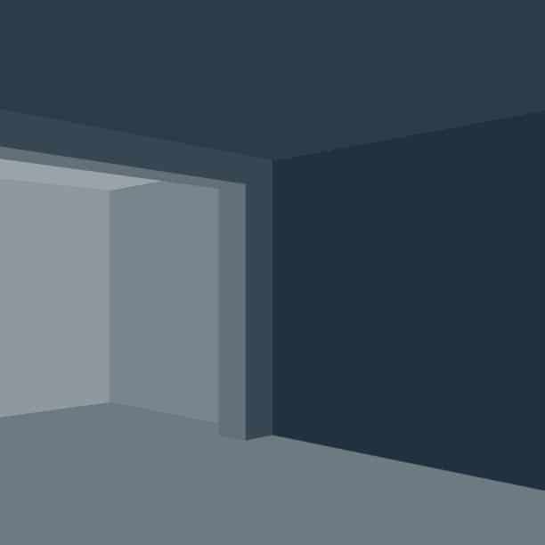
Here are two extreme examples of how you can make a back room appear smaller, or much larger. Dark colors shrink the space, while lighter colors expand the space:


If you have two rooms of unequal size, you can use color to balance out the space and create a transition that pulls the two spaces together. By gradually using lighter colors as you move into a smaller space, you create the appearance of an expanding space and negate that shrinking feeling.

tall & Bright
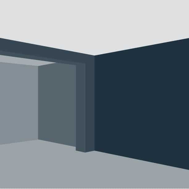
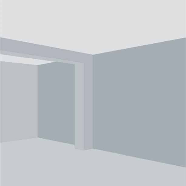
By using lighter colors on the ceiling and floor of a room, you make the room appear taller and brighter. But you don’t have to sacrifice a colorful room like the left example below. You can use a dark, saturated color for the walls of a room and pair it with a lighter ceiling and floor to keep the space looking tall and open.


5 TINY TIPS
Warm hues and high intensities are said to be visually active and stimulating.
Cool hues and low intensities are more subdued and relaxing.
Light values tend to be cheerful. Middle values tend to be undemanding.
Dark values tend to be somber.
Deep cool colors appear to contract. Light warm colors tend to expand and increase the apparent size of an object, especially when seen against a dark background.
Bright, saturated colors and any strong contrasts attract our attention. Grayed values hues and middle values are less forceful. Contrasting values make us aware of shapes and forms. Different hues and saturations can also define shape but if they are too similar in value the definition will be less distinct.
Light values, cool hues and grayed colors appear to recede and increase apparent distance. Warm hues appear to advance. Dark values and saturated colors suggest nearness.
Let's work together and
create amazing things.
LOCATE US
401 East Court Avenue, Suite 200
Des Moines, IA 50309
(Suite on south side of the building)
FOLLOW US
CONTACT US
design@818iowa.com
515-805-5239