Text Spacing: Why You Can’t Always Trust Kerning
making text look right
One of the most important terms you should have in your typographical repertoire is kerning—the adjustment of space between two individual letters. You can adjust the kerning in a graphic program like Adobe Photoshop, Illustrator, or InDesign by increasing or decreasing the kerning value in the Character panel. There are a few auto-kerning tools in the dropdown menu like metric kerning and optical kerning, which adjust the spacing between letters based on their shapes. These are great, quick options if your overall text is looking too squished together or spaced out. These auto-kerning tools can be extremely helpful for everyday text editing, but when it comes to headlines, logos, and other important uses for your text, you will absolutely want to manually adjust the kerning.
WHAT’S THE DIFFERENCE?
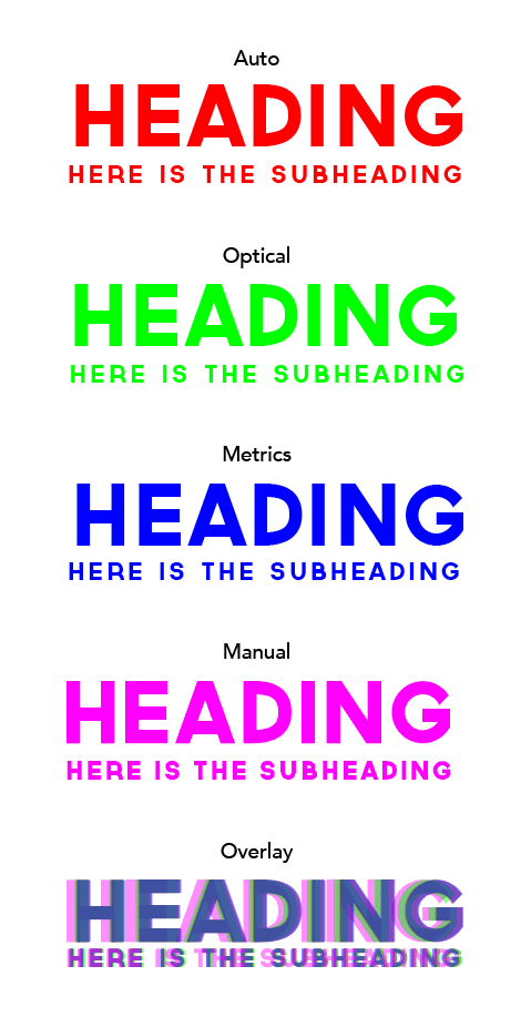
The following examples show the differences between the Auto, Optical, and Metric kerning options compared to text that underwent manually kerning. All of the text is justified, or lined up, on the left side of the text bounding boxes. You can see how the versions differ and how they align when overlaid on top of each other. Right away, it is clear that the headings do not properly line up with the subheadings for the Auto, Optical, and Metric kerning options. This is the first example of why you can’t always trust your font, and why you will need to use your own eyes to adjust the alignment of your text. In addition to manually adjusting the kerning between letters, you should consider manually adjusting the space between words, as demonstrated in the Manual kerning subheading.
WHAT IS TRACKING?
“Another important term in typography is tracking. Tracking is the adjustment of letter spacing in relation to the words as a whole. This is useful when you would like your text to expand or contract to take up a certain amount of space on a line. Tracking is helpful when you are using multiple text sizes in the same composition, as the kerning between letters is proportional to the size of your text. In the provided examples, the tracking of the headings is set to 0 while the subheadings are set to 100 to give more room between letters. This difference helps to improve both the balance of the heading and subheading and the readability of the text as a whole.
Still a little confusing? Watch this helpful video below that will help you decipher between kerning, leading, and tracking.
TYPOGRAPHY TIPS FOR DIFFICULT LETTERS
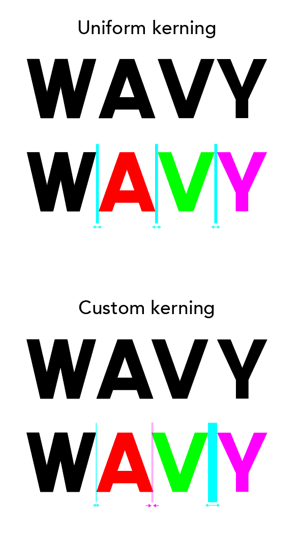
Letters and numbers have very unique relationships with each other, and kerning does not have a simple mathematical equation for the appearance of equal spacing. The most difficult letters to kern are those that create a lot of negative space, like the diagonal-heavy A, V, and Y. Check out the difference between uniform and custom kerning in the word “WAVY.”
IT’S IN THE DETAILS
If you use uniform kerning to mathematically space out the letters, there is an obvious visual imbalance to the overall text. The letter V looks a lot closer next to Y than it does next to A. In order to fake the appearance of equal spacing in this example, the kerning between A and V needs to be set to a negative value, and the kerning between V and Y should be much higher. Successful kerning will give the appearance of equal spacing without literally setting equal kerning values.
KEYBOARD SHORTCUTS
In graphic programs like Adobe Photoshop, Illustrator, or InDesign, there are a few keyboard shortcuts that will make manual kerning a breeze. With your cursor set between two letters, you can use the left and right Arrow Keys while holding down the Command Key (or Alt for PC) to decrease and increase the kerning values. Just take your finger off the command key to navigate between letters and adjust the kerning until all of the spaces between letters appears balanced. To adjust the tracking of entire words or passages, highlight either the text bounding box or highlight entire words and use the same Command-Arrow shortcuts to decrease or increase the tracking values.
TRY IT OUT!
Think you’ve got what it takes to manually adjust your text kerning? To get started, you can practice online with this awesome kerning game that tests your spatial judgment against a professional typographer. If you’d rather spend your valuable time somewhere else, you can always hire a designer and delegate your kerning needs to the seasoned pros. 😊
Let's work together and
create amazing things.
LOCATE US
401 East Court Avenue, Suite 200
Des Moines, IA 50309
(Suite on south side of the building)
FOLLOW US
CONTACT US
design@818iowa.com
515-805-5239