Combatting Can Color Catastrophes
FROM CONCEPT TO SHELF.
Many of you are familiar with what Pantone® Swatches are and have likely used their color books for color matching, but did you know that color matching for direct-printed beverage cans works MUCH differently?
Because the printing method and substrate for aluminum is so different from paper, there are limitations for direct-printed cans (commonly referred to as 2-piece cans). At 818, we own an INX 2-Piece Metal Color Catalog and utilize it for our clients throughout our design process. This color catalog tool helps us determine 2-piece can color selections more efficiently which results in faster lead times for our clients and their product out in the market quicker.


What IS INX?
What is the INX 2-Piece Color Catalog, you ask? The company describes it as:
“ The INX Color Catalog is the only industry-standard metal swatch catalog developed to assist brand owners, designers, and metal decorators, select, communicate, and approve color throughout the design process. The proprietary INX numbering system includes 600+ removable metal color swatches and access to the same INX colors via the INX Digital Color Library— available for use in today’s design programs.”
Watch a quick video explaining how it works below!
SEE IT IN ACTION
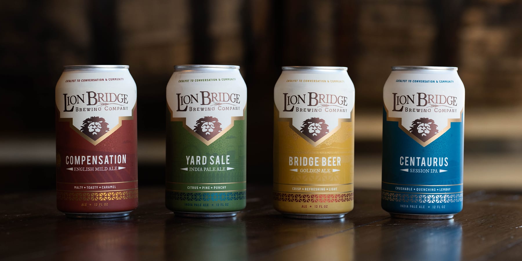
When Lion Bridge decided to move into packaging, we worked with them on their strategy for labeling. In order to get their product to market as quickly as possible, they decided to go with shrink-wrapped cans out of the gate while we worked through the process and details of the final solution together.
Since lead times for direct-print cans is so lengthy (typically around 3 months) and since the minimum quantity is so high (typically a truck load of ~10,000 cans), we needed to develop a more flexible and cost-effective plan together. But, this plan needed to include some upfront planning to keep the 2 different label solutions as similar as possible in order to eliminate any visual confusion or inconsistencies in the marketplace when the eventual labeling method switch happened.
The plan for the final solution was to utilize a custom, universal “blank” design can as the backdrop for later applied paper labels. This would give Lion Bridge a unique can, an opportunity for a brand message at the top, and a consistent color to work with. But, speaking of consistent color…. We had to make sure we found a can print color to match the shrink sleeves as close as possible to, and after that, we had to color match the labels to the can. While that might sound easy, in reality, this process was more difficult than you might think!

Celebrating success
Today we often receive compliments on how well this project turned out — in particular regarding the color matching between the can and label. We chalk the success up to the strategic planning & teamwork with our clients, our persistent designers, our useful color matching tools and our awesome print vendors. Cheers to everyone on the excellent, collaborative work!
“Nice job.”
– Quin, Lion Bridge Brewing Company
See more of our Lion Bridge design work here. Need design help? Let’s talk more! Contact us today and see how we can help you on your next project.


Let's work together and
create amazing things.
LOCATE US
401 East Court Avenue, Suite 200
Des Moines, IA 50309
(Suite on south side of the building)
FOLLOW US
CONTACT US
design@818iowa.com
515-805-5239